The navigation drawer slides in from the left and is a common pattern in apps. More...
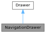
Inheritance diagram for NavigationDrawer:

Collaboration diagram for NavigationDrawer:

Detailed Description
The navigation drawer slides in from the left and is a common pattern in apps.
This is a temporary navigation drawer: it can toggle open or closed. Closed by default, this type of navigation drawer opens temporarily above all other content until a section is selected or the overlay is tapped.
This navigation drawer comes with no contents, therefore it's completely customizable.
By default the navigation drawer is permanent and pinned on desktop and temporary on mobile.
import Fluid as Fluid
Fluid.ApplicationWindow {
width: 400
height: 400
visible: true
Fluid.Button {
text: "Open"
onClicked: drawer.open()
}
Fluid.NavigationDrawer {
topContent: Image {
source: "background.png"
width: parent.width
height: 200
}
Fluid.ListItem {
icon.source: Fluid.Utils.iconUrl("content/inbox")
text: "Inbox"
}
Fluid.ListItem {
icon.source: Fluid.Utils.iconUrl("content/archive")
text: "Archive"
}
Fluid.ListItem {
icon.source: Fluid.Utils.iconUrl("action/settings")
text: "Settings"
showDivider: true
}
}
}
Definition elevationmaterial.cpp:27
For more information you can read the Material Design guidelines.
The documentation for this class was generated from the following file:
- /home/runner/work/docs/docs/fluid/src/controls/qml/navigation/NavigationDrawer.qml